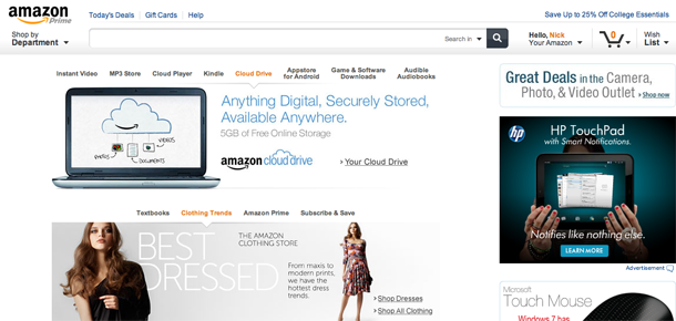
Make no mistake about it, I’m an Amazon junkie. When I purchase anything — from HDTVs to a filter for my aquarium to breakfast cereal — I check Amazon first to see if it’s a better deal. You can imagine my excitement when I saw Amazon redesigned their site this week, to streamline and make it easier to find things.
Larger, friendlier, and more aesthetically pleasing, the new Amazon site offers convenient dropdown quicklinks, a simpler home page interface and, overall, a happier place to shop. One of the complaints I had prior was that the site had a junky look to it with boxes and boxes of random products you might want. I didn’t want those things. Okay, most of those of things. Those sections haven’t gone away completely, but now float nicely on the page. Amazon has taken a page out of Apple’s book and made a lot more Javascript additions to make the site a little more intuitive and user-friendly.
One neat feature is that when you click on the search field, it drops down the deals and freebies of the day. That’s a convenient addition for people who check Amazon daily (me).
And really, the site is just prettier. The web designer in me in much happier with this, and my bank account will be much sadder.
- Amazon Dropdown Freebie Menu
- Amazon Flyout Menu
- Amazon’s Previous Design


Oh my. And I was just there a couple of days ago. And I was thinking last night of ordering something, but resisted temptation. But now I have an excuse to … “just go look.”